Extreme Value Forecasting


Requires a Wolfram Notebook System
Interact on desktop, mobile and cloud with the free Wolfram Player or other Wolfram Language products.
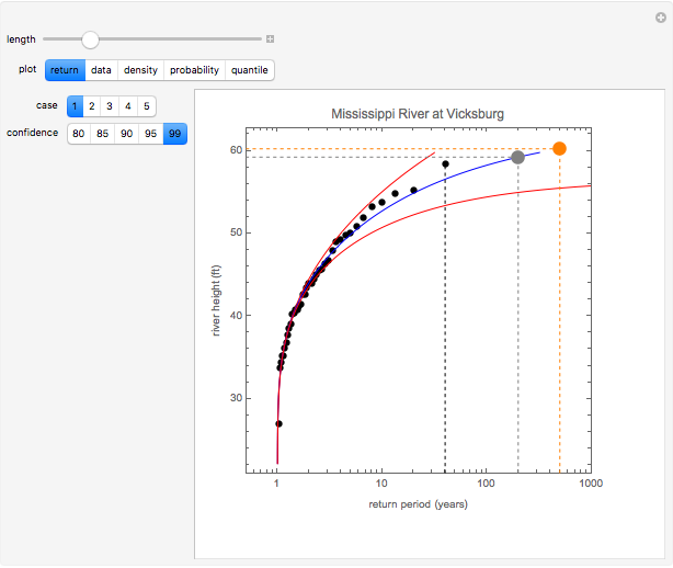
The application of extreme value theory to block maxima data is illustrated in this Demonstration, using five datasets drawn from the diverse fields of hydrology and Doppler radar. Even though the times and scales of this data are very different, extreme value theory proves to be a very useful tool for analyzing it. Specifically, this Demonstration lets you view the sensitivity of the extreme value return diagram (also known as the Gumbel plot) to the length of the data record and the degree of confidence that is desired in the prediction. The computations shown in this distribution are based upon fitting data to the generalized extreme value distribution, which is implemented in Mathematica as the MaxStableDistribution.
Contributed by: Marshall Bradley (January 2015)
Open content licensed under CC BY-NC-SA
Snapshots
Details
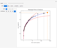
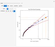
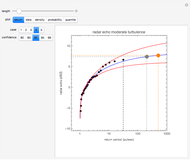
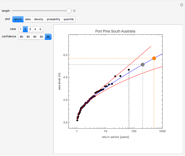
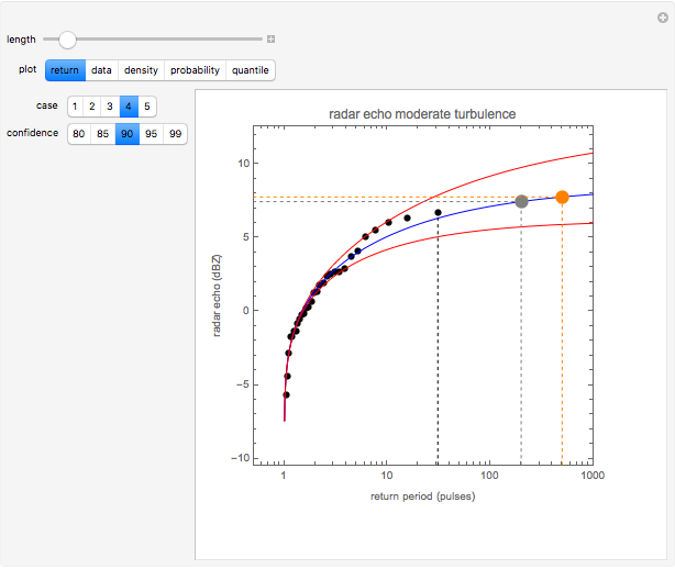
The first hydrology dataset is the maximal yearly height of the Mississippi River at Vicksburg, Missouri, observed over the time period 1914 to 2014. The second hydrology dataset is the maximum observed annual sea level at Port Pirie in southern Australia over the time period 1923 to 1987. The last three datasets are the maximum observed dBZ backscatter level observed on a pulse Doppler radar. The radar data was measured over a time period of 100 radar pulses. The quantity dBZ is the standard reflectivity unit used in radar meteorological applications.
The first radar dataset was measured during a time period when there was strong radar backscatter from atmospheric turbulence in the convective boundary layer. The second radar dataset was measured during a time period of moderate turbulence. The last radar dataset was measured when strongly reflecting turbulent outliers were present.
In each of these five cases, the datasets represent the output from a block maximum analysis. This means that data was grouped into spans of equal length in time, and maximum values were taken of the data in each block. For the two hydrology datasets, raw data was grouped into blocks of one-year length, and the maximum of each block was taken. For the three radar datasets, the length of the time block was the length of the time interval required to produce a single radar altitude-Doppler velocity gram. This value was 10 seconds for the radar data used in this Demonstration. Thus the radar data represents a total time span of 1000 seconds, whereas the meteorological data represents time spans of either 65 or 100 years.
If the sequence  denotes the observed maximum values from data blocks of equal length at equally spaced times
  , then it will often be the case that the observations
  are distributed in accordance with the generalized extreme value distribution
  , whose cumulative probability density function is given by
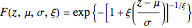 .
.
This distribution is defined on  such that
  and where
  ,
,  , and
, and  . The parameters
  ,
,  , and
, and  are respectively the location, scale, and shape factors of the random variable . In Mathematica, the generalized extreme value distribution is implemented via the function MaxStableDistribution[μ,σ,ξ].
An extreme value analysis of a dataset begins by sorting the observed return level data into a list with  and then computing the observed cumulative probability distribution function
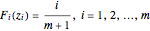 .
.
For the hydrological examples used here, the units of return are either river height in feet or sea level in meters. For the radar examples, return is measured on a dBZ scale. The next step in an extreme value analysis of a dataset is to use the observed data to estimate the best-fit parameters ( ,
,  ,
,  ) to the extreme value distribution
  . Once these two steps are taken, it is possible to construct a variety of useful plots and diagrams that characterize the data and that facilitate extrapolations beyond the observed ranges in the data.
An effective tool for assessing the likelihood of future returns that exceed the observed returns in the measured data is referred to as a return plot or a return value plot. A return plot is just a comparison of the measured data points  for
for  to a plot of the parametric curve
 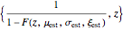 . By computing the parametric curve at values of such that
  , the measured data is mathematically projected beyond the range of observed values.
In the return plot shown in this Demonstration, the observed return values are the large black points, and the parametric curve is shown via the blue line. The dashed black line indicates the largest observed return for the time window that is being analyzed. The large gray and orange dots indicate the projected maximum return at time epochs of 200 and 500. For the hydrological data, time epochs are measured in years, and for the radar data, time epochs are measured in units of pulse number. The red lines on either side of the blue line show the estimated confidence in the fit of the observed data to the extreme value distribution. As the desired degree of confidence increases, the red curves move farther away from the blue curve.
In addition to the return plot, the Demonstration has the capability to show a plot of the raw data, the density plot, the probability plot, and the quantile plot. The probability and return plots are respectively plots of the points  and
and  . If the fit between the observed data and the fitted extreme value distribution is good, then the points in the probability plot and the quantile plot fall close to the diagonal line shown in each of these two plots. The density plot compares the observed histogram of the data to the fitted probability density distribution. Additional details concerning the computation and application of the plots shown in this Demonstration can be found in [1] and [2].
In the Demonstration, "length" controls the amount of data that is used. When you move "length" all the way to the left, only the first 25 data values are used in the extreme value analysis. As you move the control "length" to the right, additional data points are used. By selecting the plot entitled "data," you can see the specific data values being used in the analysis, which are indicated by the larger, darker points.
References
[1] Stuart Coles, An Introduction to Statistical Modeling of Extreme Values, London: Springer, 2004.
[2] Christoph Frei. "Section 4: Extreme Value Analysis–An Introduction," in Analysis of Climate and Weather Data. (Jan 27, 2015) www.iac.ethz.ch/edu/courses/master/electives/acwd/Xstat.pdf.
Permanent Citation
 Forecasting with Exponential Moving Averages
Bruce Atwood and Lingzhi Meng Mean, Fitted-Value, Error, and Residual in Simple Linear Regression
Ian McLeod Mean, Median, and Standard Deviation for Random Values
Stephen Wolfram Linear Regression
Mikel Landajuela Nonparametric Additive Modeling by Smoothing Splines: Robust Unbiased-Risk-Estimate Selector and a Nonisotropic-Smoothing Improvement
Didier A. Girard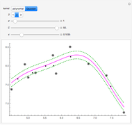 Method of Support Vector Regression
Heikki Ruskeepää Local Regression for Country Data
Heikki Ruskeepää Exploring Measures of Association
Jeff Hamrick Zipf's Law for U.S. Cities
Fiona Maclachlan Hypothesis Tests about a Population Mean
Chris Boucher
-
 Bayesian Distribution of Sample Mean
Marshall Bradley -
 Fluid Flow around a Corner
Marshall Bradley -
 Underwater Vehicle Pressure Signature
Marshall Bradley -
 Extreme Value Forecasting
Marshall Bradley -
 Target Motion with the Metropolis-Hastings Algorithm
Marshall Bradley -
 Noise Temperature of a Radar System
Marshall Bradley -
 High-Frequency Sonar Performance
Marshall Bradley -
 Atmospheric Radar Wave Absorption
Marshall Bradley -
 Equine Motion
Marshall Bradley -
 Frequency-Modulated Continuous-Wave (FMCW) Radar
Marshall Bradley -
 Maximum Entropy Probability Density Functions
Marshall Bradley -
 Uncertainty in Sonar Performance Prediction
Marshall Bradley -
 Micro-Doppler Sonar Simulation
Marshall Bradley -
 Human Walking Animation
Marshall Bradley -
 Bayesian Range Weighting for Sonar
Marshall Bradley