Investor Perceptions of the Relationship of S&P 500 Stocks


Requires a Wolfram Notebook System
Interact on desktop, mobile and cloud with the free Wolfram Player or other Wolfram Language products.
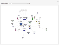
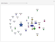
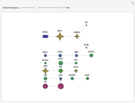
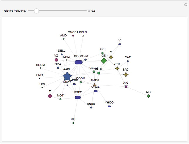
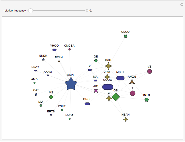
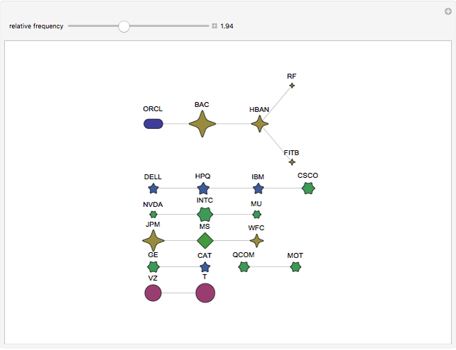
This Demonstration shows a graph of investors’ perceptions of how stocks are related, based on information from an online stock forum on Twitter [1]. Each vertex represents a stock. A line joining two vertices means that the two corresponding stocks were mentioned together in the stock forum.
[more]
Contributed by: Xuxiang (Peter) Li (March 2012)
(NYU Polytechnic Institute, Finance and Risk Engineering Department)
Open content licensed under CC BY-NC-SA
Snapshots

Details
Reference
[1] T. O. Sprenger and I. M. Welpe, "Tweets and Peers: Defining Industry Groups and Strategic Peers Based on Investor Perceptions of Stocks on Twitter," Algorithmic Finance, 1(1), 2011 pp. 57–76. http://dx.doi.org/10.3233/AF-2011-006.
Permanent Citation
"Investor Perceptions of the Relationship of S&P 500 Stocks"
http://demonstrations.wolfram.com/InvestorPerceptionsOfTheRelationshipOfSP500Stocks/
Wolfram Demonstrations Project
Published: March 8 2012
 Adaptive Mesh Trinomial Tree for Vanilla Option Pricing
Darius Kirevicius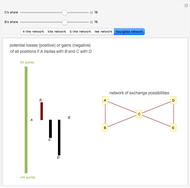 The Power-Dependence Solution to Five Exchange Networks
Phillip Bonacich Fitting the Meixner Distribution to S&P 500 Returns
Andrzej Kozlowski Using Tensors to Analyze a Large Portfolio of Stocks
Rick Carey Fate of a Long-Term Index Fund Investment According to the S&P 500
Mark D. Normand Stock Forecasting
Andrew Tao Stock Option Strategies
Joseph D. Haley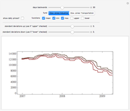 Stock Price Envelopes
Seth J. Chandler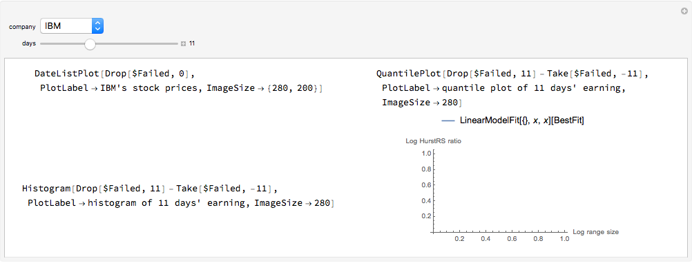 Hurst Exponent of Stock Price
Yushi Wang Stock Prices of Technology Companies
Eugene Poberezkin